An intuitive data platform that fits your organisation.
Combine the world's largest open indicator databases, the best charting engine with dashboarding and scientific analysis tools — all in one platform.
Combine the world's largest open indicator databases, the best charting engine with dashboarding and scientific analysis tools — all in one platform.
From your data to a live platform in days
An open source framework that transforms any catalogue of structured data into an interactive exploration platform — with maps, charts, scatter plots, temporal animations and native download.
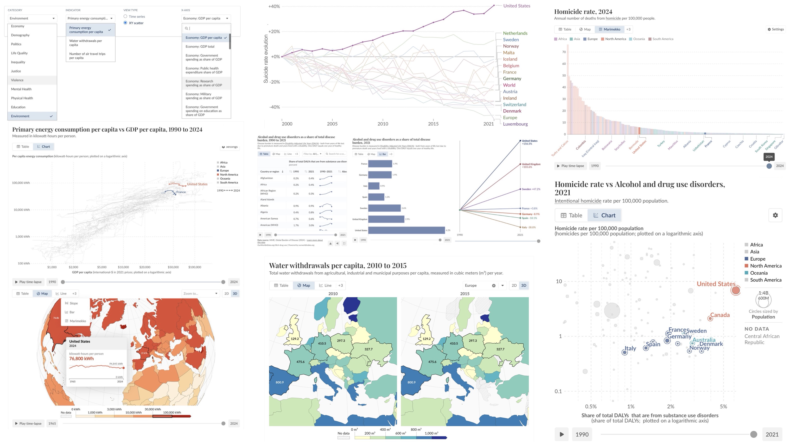
Cross any indicators against each other to reveal correlations or significant trends that can evolve over time. Regression fits and correlation analysis available via the Scientific analysis companion tool.
Visualisation of individual trajectories for each entity. Ideal for identifying patterns, exploring causal effects, or discontinuities in evolution within a two-dimensional space.
Geographic visualisation in two or three dimensions of each indicator, with a time slider and visual comparison centred on any region of the world.
Dynamic rankings by indicator, animated over time, for each entity (country or other). Immediate comparison of relative positions, coloured by data group.
Bar chart races, accessible on all global data. Direct comparisons across entities, sortable and animated, revealing gaps at a glance. Includes a slope view for simplified trend visualisation.
Evolution over decades, multi-entity, with animation and Play button. Linear or logarithmic scale, percentage normalisation available. Ability to add projections across different scenarios, observe relative change, etc. Temporal trend fitting and extrapolation available via the Scientific analysis tool.
Explorer Creator is Xplore's self-service interface. Select indicators from 9 institutional data sources, configure your selection, and get a shareable public URL — no code, no server, no waiting.
Browse 10,000+ indicators from 9 institutional sources. Filter by theme, source or temporal coverage.
Name the explorer, combine multi-source indicators in a single basket, add your own CSV data.
An automated pipeline downloads the data, generates the charts and deploys the explorer on a public URL.
9 available sources
Upload a CSV or connect a Google Sheet — each tab becomes a category of indicators. Your data is automatically integrated and cross-referenceable with the 10,000+ public indicators in the same explorer.
Xplore includes a full layer of tools for deeper analysis, communication, and teaching — all built on the same indicator databases.
Regression, clustering, forecasting, breakpoint detection — directly on any open indicator dataset. No code, no export.
Build data-driven presentations from your indicators. Share as a URL or embed anywhere — live charts included.
Turn indicator data into interactive multiple-choice learning experiences. Link each question to a live chart.
Xplore adapts to your workflow. Pick your profile to see exactly what it can do for you.
New data source, custom analysis, specific output format — we scope it with you. We're a small, agile structure: your project gets our full attention, not a support ticket queue.
Before being a framework, Xplore is a response to a concrete frustration. The Modern Societies Observatory (MSO) was born from the observation that the large institutional datasets on how societies function — available, validated, invaluable — did not have the interface they deserved.
The MSO is one example of an Xplore instance — a thematic observatory built on the same infrastructure that lets any user create their own explorer in minutes, add scientific analyses, and share interactive presentations. It is not the product itself, but a demonstration of what can be built with it.
The OSC is not a simulated demonstration. It is a production platform, publicly accessible, used for research, teaching and science communication. It illustrates what Xplore can deploy for your organisation — with your data, on your domain.
Explore the Observatory →
Contact us to discuss your project. We support every organisation
from data ingestion through to platform launch.
See the demo first