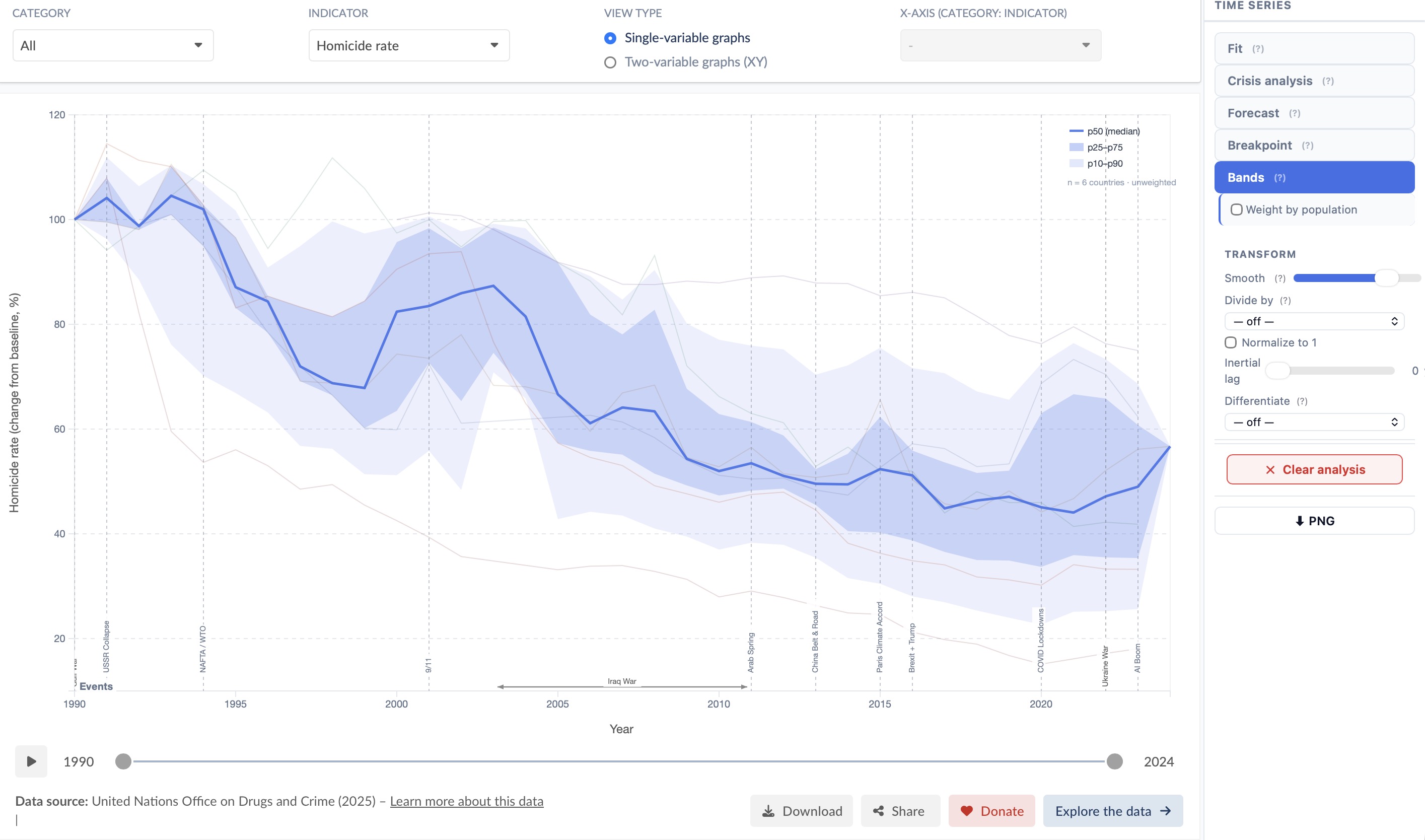
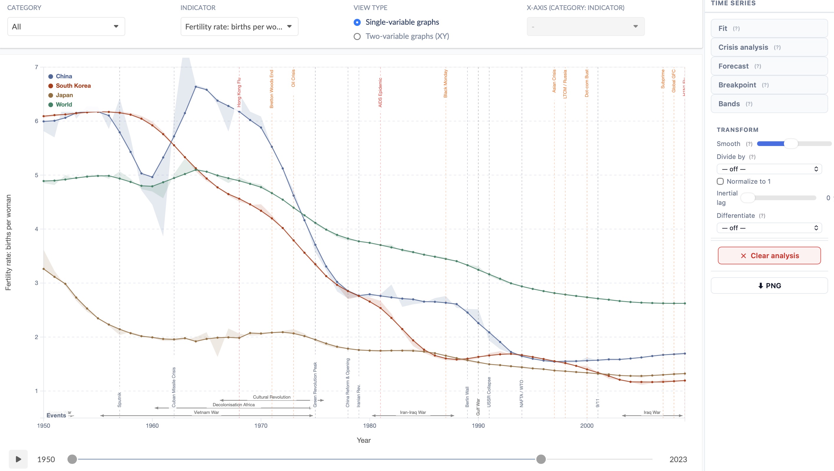
Scientific Analysis

Research-grade charts.
Zero setup.

Pick any indicator, activate an analysis mode, get an interactive publication-ready result.

How it works

1

Open any Explorer

Pick from thousands of indicators across OWID, World Bank, IMF and OECD — all accessible from the same unified interface.

2

Click Analyze

The analysis panel activates automatically in XY or Temporal mode based on the chart type currently displayed.

3

Customise your scope

Select any country or group of countries, any time span — the analysis updates instantly.


Scatter & Cross-sectional

XY Analysis

When a two-variable scatter chart is active, Xplore gives you a full statistical toolkit to understand cross-country relationships.
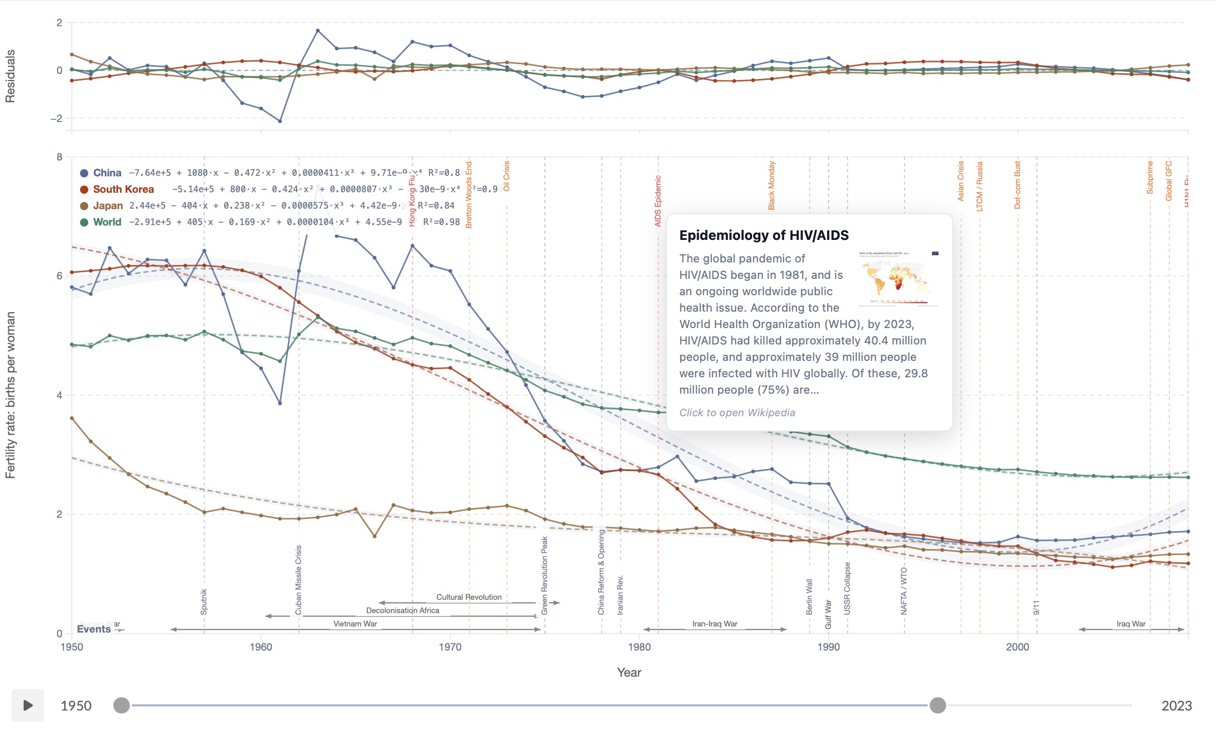
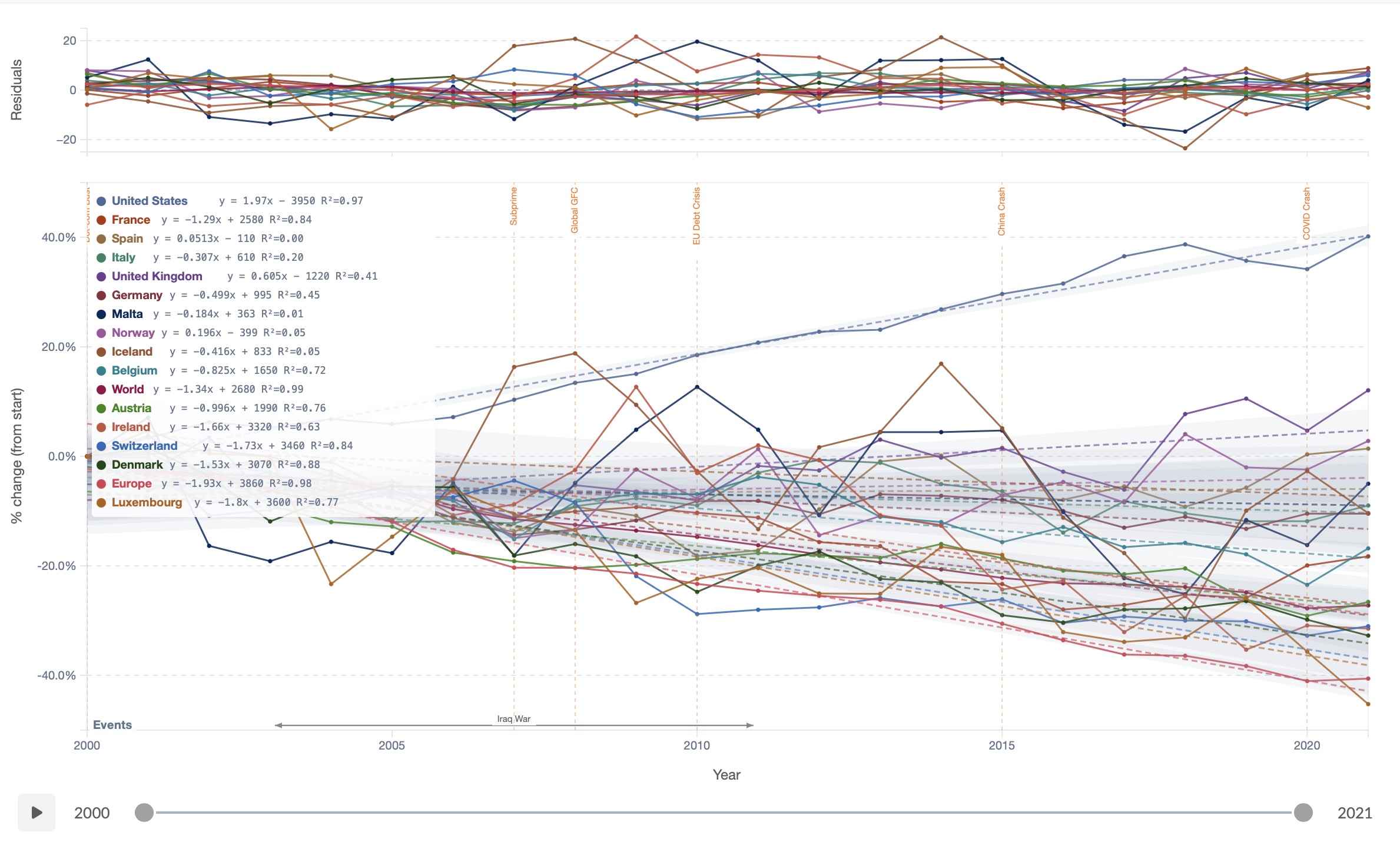
Regression fit on a scatter plot Regression fit

Regression Fit

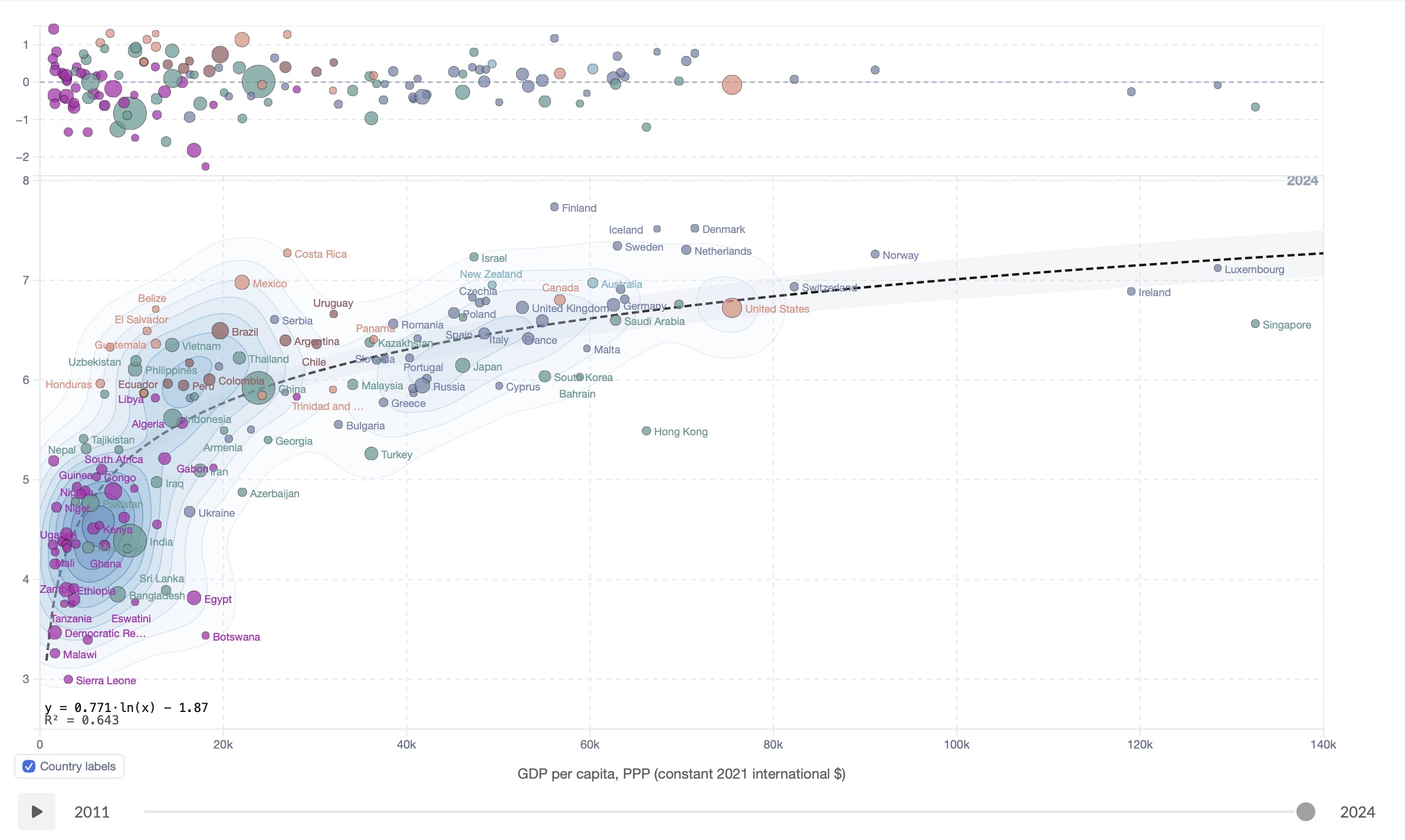
Fit any scatter with linear, polynomial (up to degree 6), exponential, log or power curves. The equation and R² appear directly on the chart. A residuals panel below shows each country's deviation from the trend line — instantly revealing outliers and structural patterns.
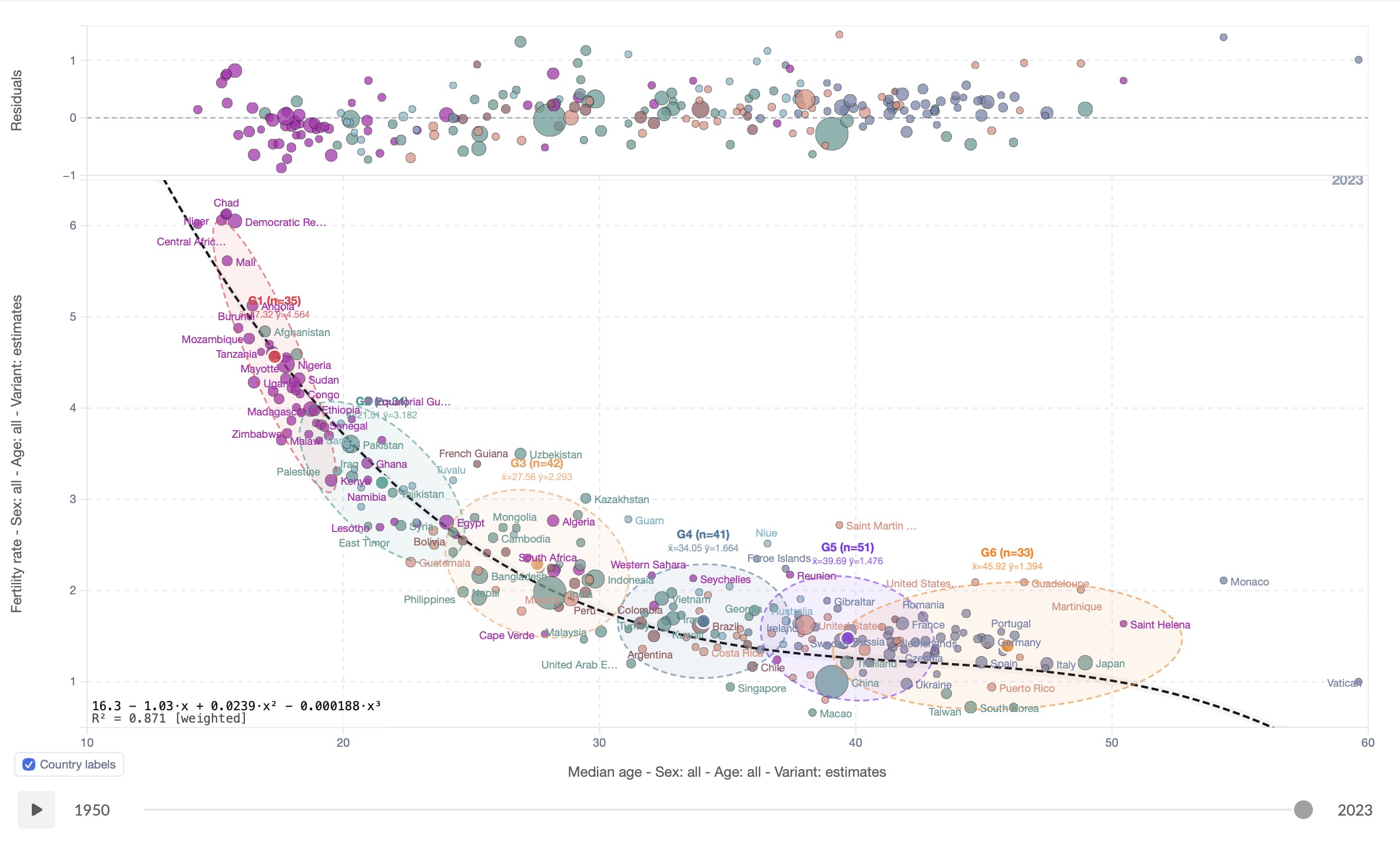
Linear Polynomial Exponential Log Power Residuals
K-Means clustering on a scatter plot

K-Means Clustering

Group countries into 2–8 clusters using K-Means++ initialisation. Coloured ellipses reveal natural groupings — developed, emerging, least-developed — with optional population weighting. Combine with the regression fit to see how clusters deviate from the global trend.
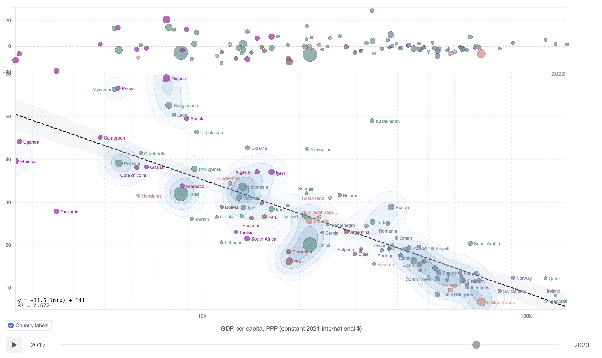
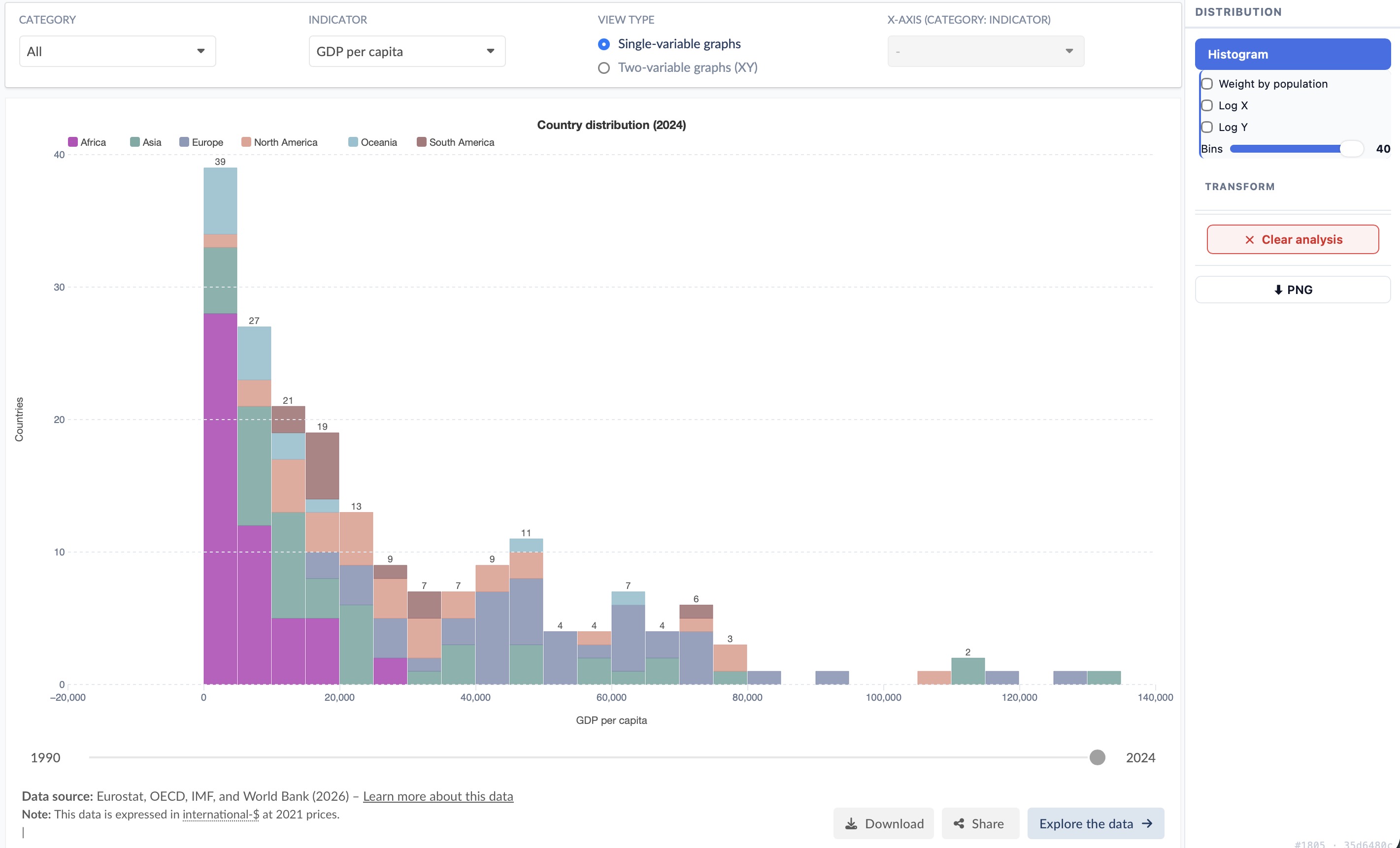
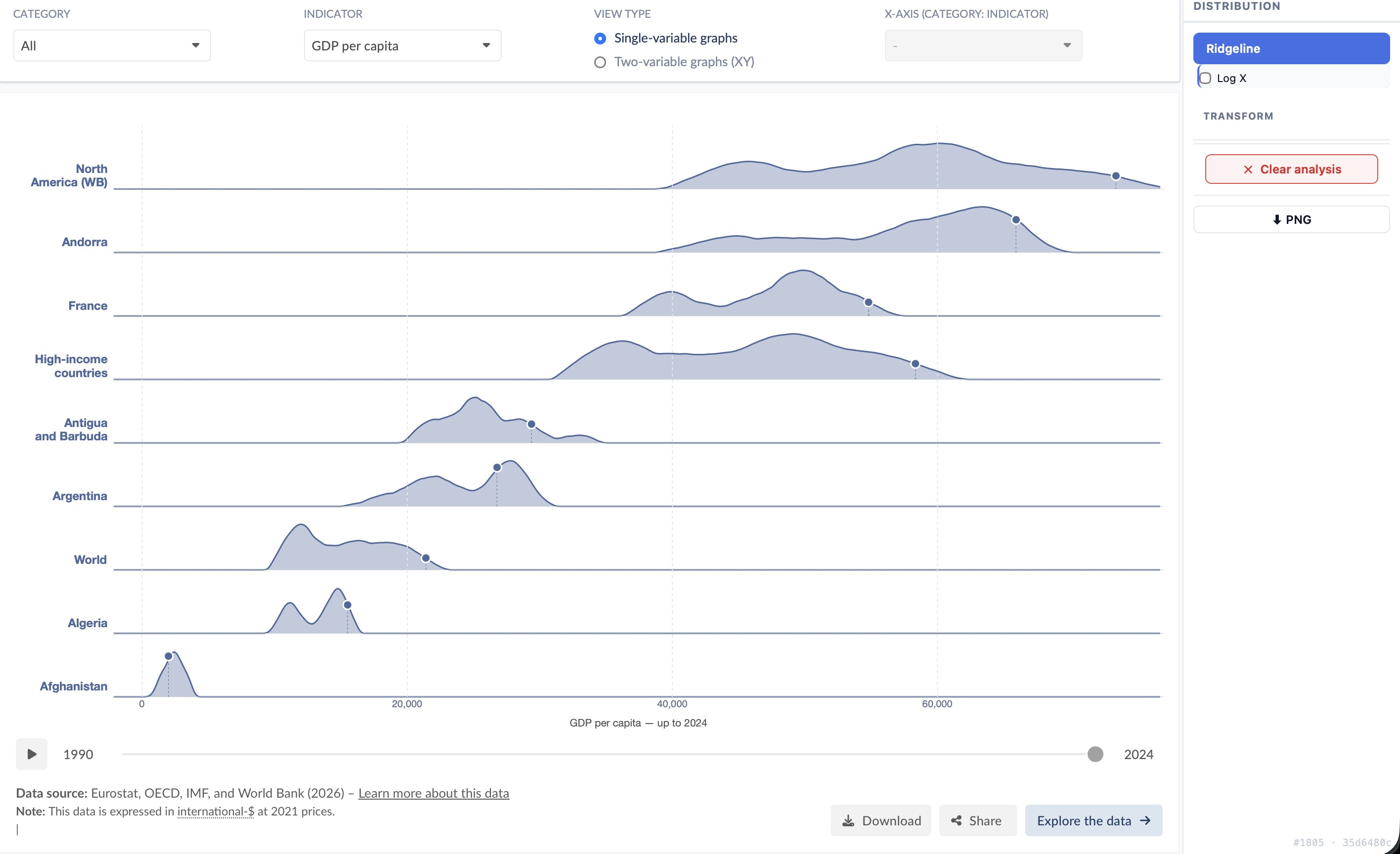
K-Means++ Population-weighted Cluster ellipses
2D density contours on a scatter plot

Density Contours

Overlay 2D kernel density contours to see where countries concentrate in the scatter space. Combine with K-Means to compare cluster density patterns, or use alone to identify the core distribution versus sparse outliers.
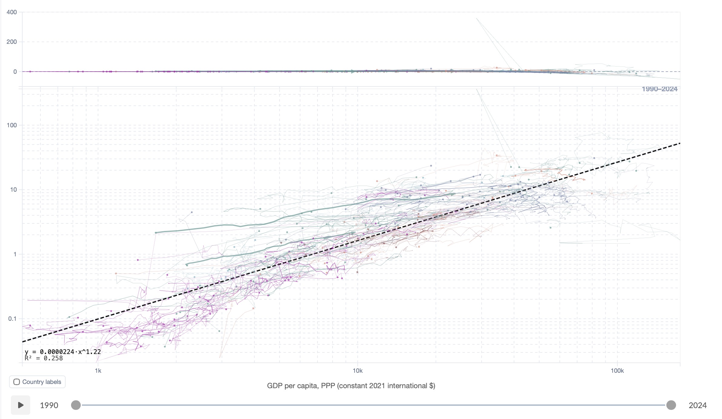
Kernel density 2D contours Overlay-ready
2D trajectories on a scatter plot over a date range Trajectories 2D

Trajectories 2D

When a date range is selected, each country becomes a parametric curve tracing its path through the scatter space over time. Arrows indicate the direction of change. Hover a trajectory to reveal year-by-year dots and labels. A clear visual language for convergence, divergence, and structural shifts.
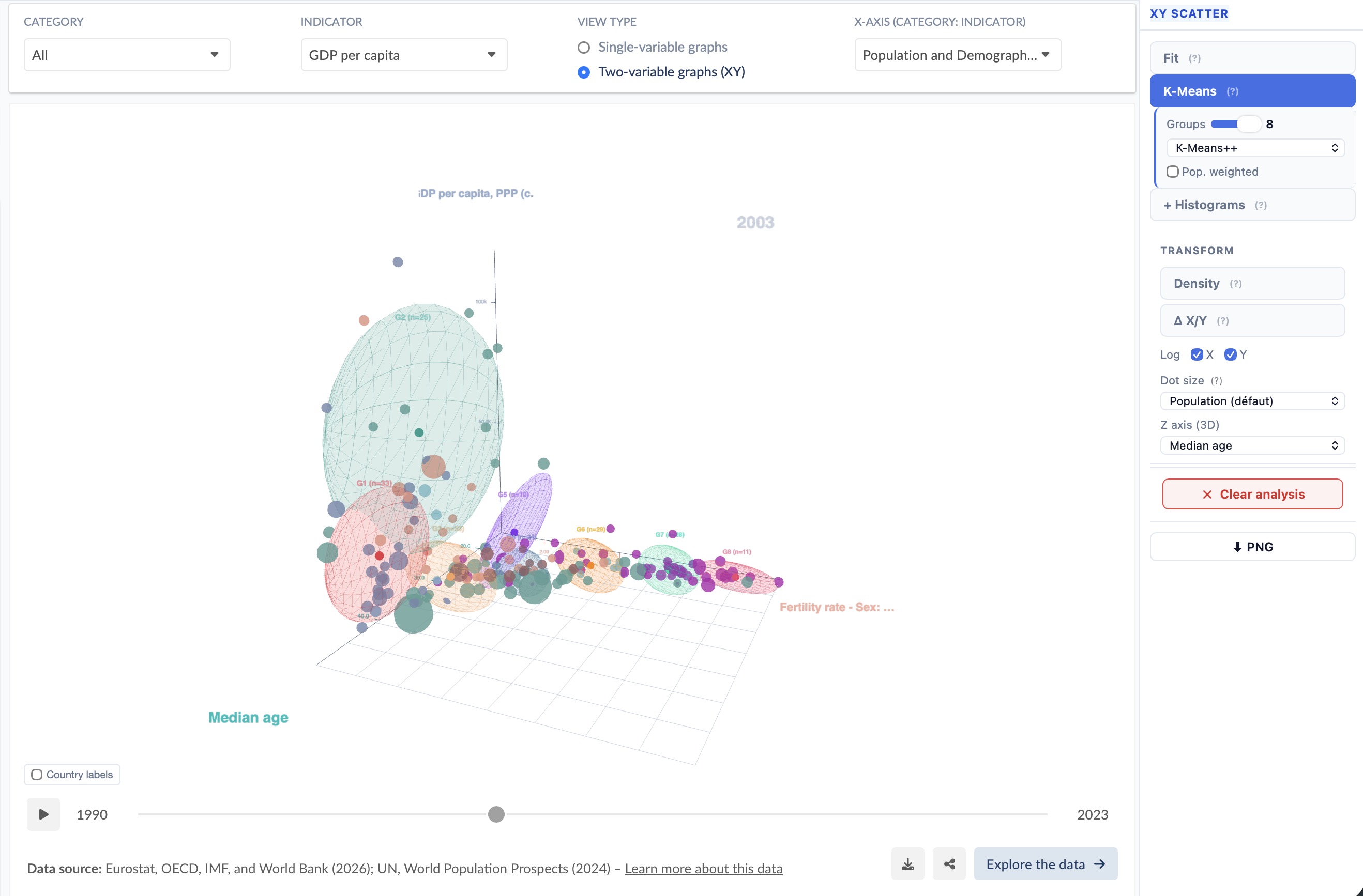
Date range Per-country paths Convergence analysis
3D scatter plot with trajectories and regression surface 3D Scatter

3D Scatter

Select a Z-axis indicator to project any scatter into a fully interactive 3D space. Drag to rotate, scroll to zoom. All the 2D tools extend into the third dimension: trajectories become 3D tube paths with arrowhead cones, the regression fit becomes an OLS surface z = f(x, y) with equation and R² overlay, and K-Means draws semi-transparent ellipsoids fitted to the 3D covariance of each cluster. A mini gizmo in the corner keeps you oriented as you explore.

3D rotation Regression surface 3D trajectories K-Means ellipsoids R² overlay
Drag selection on a scatter plot

Drag Selection

Draw a rectangle on any scatter to select a subset of countries. The regression fit and all overlays immediately update to reflect only the selected group — useful for focusing on a specific income bracket or geographic region.
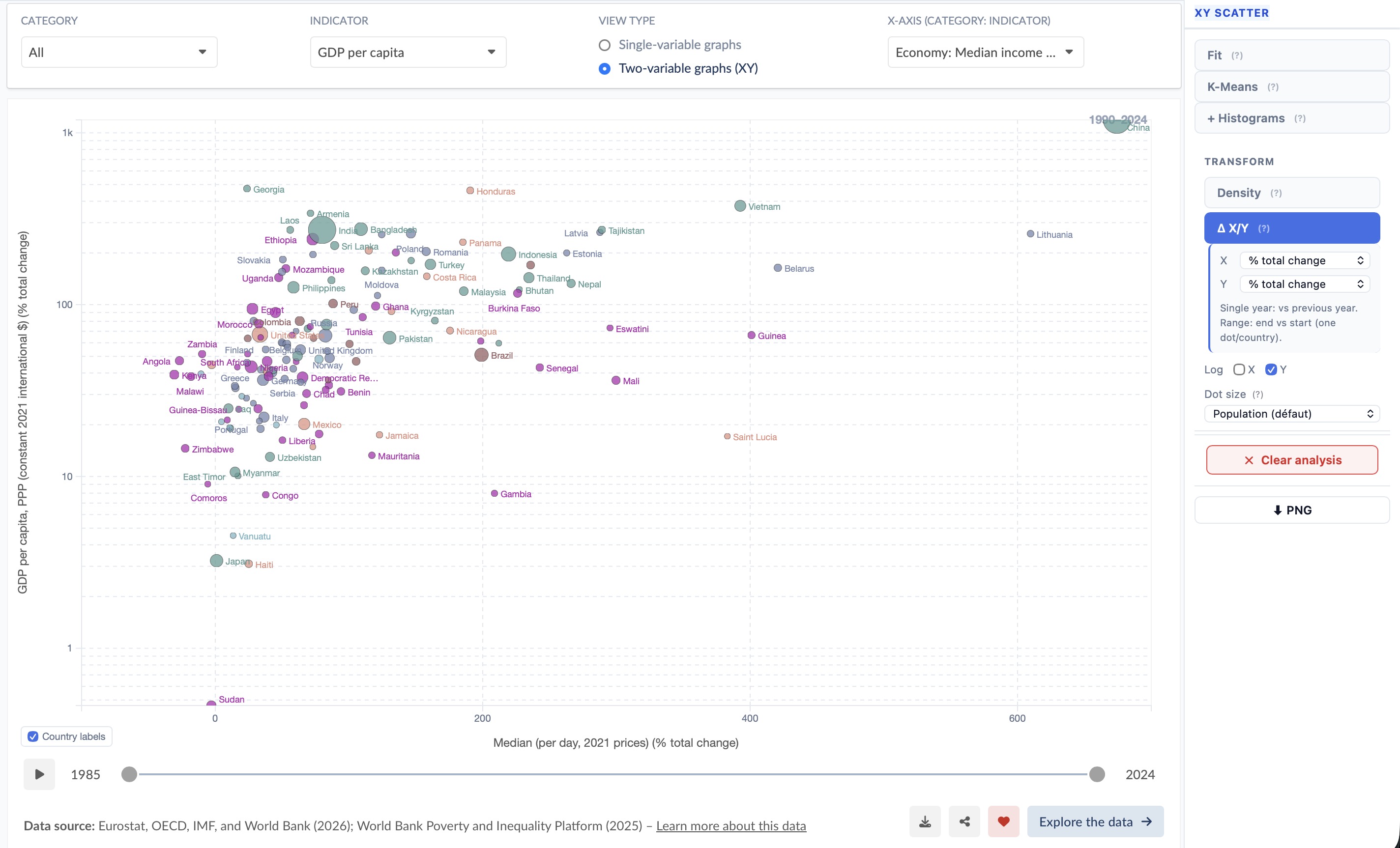
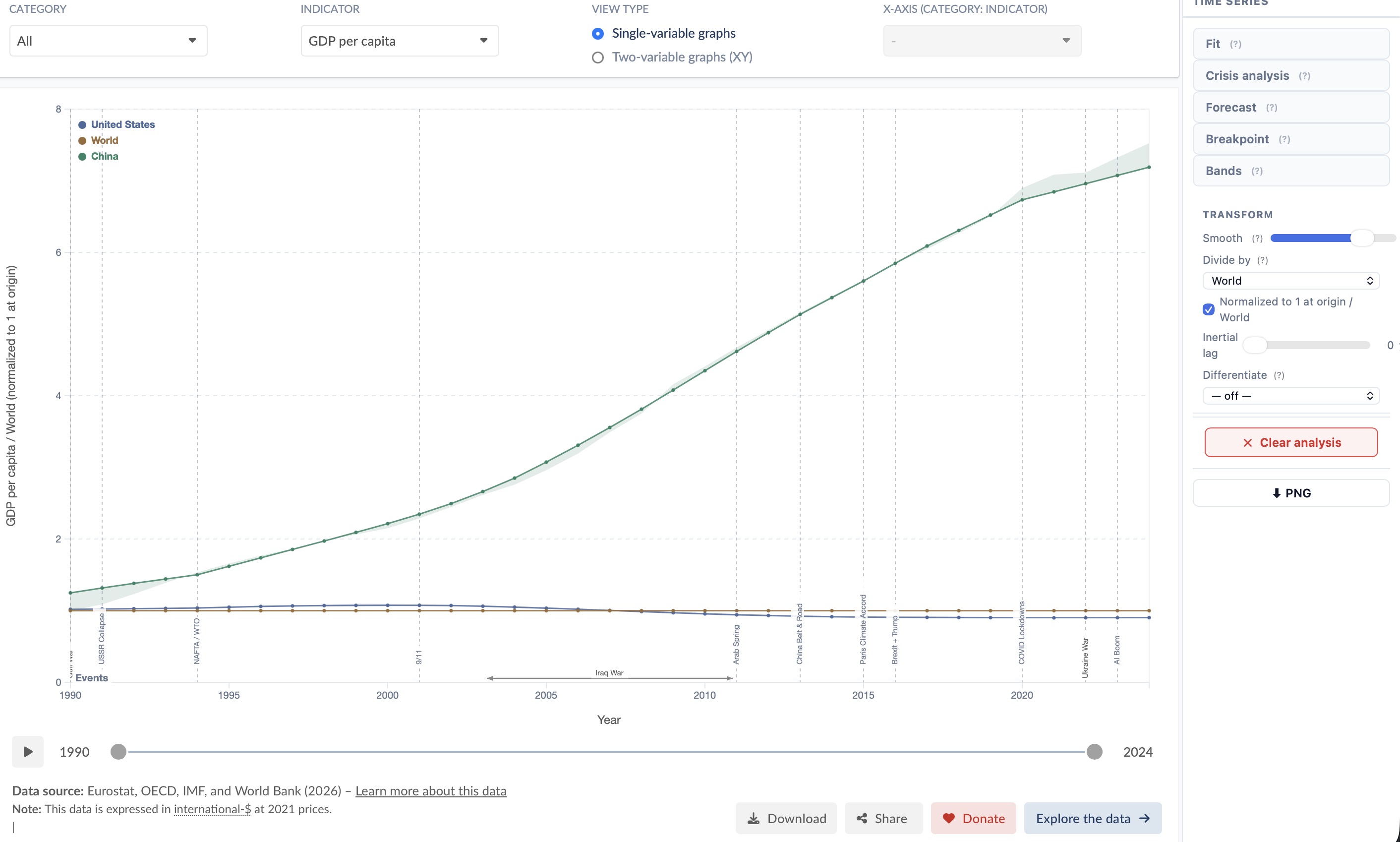
Lasso selection Subset analysis
Delta X/Y transform on a scatter plot

Δ X/Y Transform

Plot change instead of levels: absolute Δ, % total change, or CAGR. In single-year mode each country shows its value relative to the previous year. In range mode every country collapses to one dot representing total change from the range start to its end — all fits, K-Means, density contours and marginal histograms update to the transformed coordinates.

Absolute Δ % total change CAGR Range collapse

Time Series

Temporal Analysis

When a line chart is active, switch between a full suite of time-series analyzers. All work on multiple countries simultaneously and update in real time.

Time series fit with events overlay Time series fit · Events overlay

Time Series Fit

Fit linear, polynomial, exponential, log, power, moving-average or logistic curves to any country's time series. Restrict the fit range with year sliders for a focused view. A residuals panel reveals systematic deviations. Combine with the Events Overlay to contextualise structural breaks within the historical record.

Linear · Poly · Expo Fit range sliders Residuals panel
Crisis fit with Gaussian deconvolution of shocks Crisis fit · Shock detection

Crisis Fit

Detect and characterise sudden shocks in a time series. Each crisis is modelled as a Gaussian or asymmetric-Gaussian perturbation on top of the long-term trend. The fit reports the event year, amplitude A (deviation from trend), duration σ in years, and signal-to-noise ratio — letting you compare the severity of wars, famines, pandemics and financial crises on a common scale.

Gaussian shock model Amplitude & duration SNR Multi-country
Structural breakpoint detection on a time series

Breakpoint Detection

Detect 1–3 structural breaks per country. Each segment is fitted independently and annotated with the year, the % level jump, and the slope before and after — making it easy to read policy transitions and economic shocks directly off the chart.

Up to 3 breaks Segment fit Level & slope change
Time series forecast with confidence bands

Forecast

Project any indicator forward up to 25 years using ARIMA, ETS or Theta models. Three stacked confidence bands (80/90/95%) visualise uncertainty. Results appear in under a second for ETS/Theta. The legend shows the projected value, model used, and in-sample MAE for each country.

ARIMA / ETS / Theta 80/90/95% CI Up to 25 yr horizon
Historical events overlay on a time series Events overlay · Elections

Events Overlay

Overlay ~82 curated global events (year 1000–2024) across four categories — wars, financial crises, pandemics, and geopolitical milestones. Elections for ~30 countries show head-of-government transitions as dots on each country's curve: Presidents ◆ above the line, Prime Ministers • below, each labeled with name and party. Hover any label to see a Wikipedia summary with thumbnail; click to open the full article.

82 global events Wars · Crises · Pandemics Elections (30 countries) Wikipedia integration
Differentiation transform applied to a time series

Differentiation Transform

Convert any level series into changes or growth rates before fitting: year-to-year Δ, % growth, cumulative % change from start, or an annualised derivative. The Y-axis label and tick format update automatically. Combine with any analyzer — including Crisis Fit or Forecast — for a fully transformed view.

Δ year-to-year % growth Cumulative change dy/dt per year
Percentile bands showing distribution across countries

Percentile Bands

Replace individual country lines with distributional bands (p10, p25, median, p75, p90). See global inequality at a glance and where selected countries sit within the distribution over time.

p10 · p25 · median · p75 · p90 Country positioning Inequality view
Moving average smoothing on a time series

Smooth

Moving-average smoothing with an adjustable window. Reduces noise before applying a fit, breakpoint detection, or crisis analysis — without permanently altering the underlying data.

Moving average Adjustable window Non-destructive
CAGR transform on a time series

CAGR %

Replace raw values with compound annual growth rates relative to a reference year. Normalises for starting level, making it easy to compare fast- and slow-growing countries on the same axis — or combine with a scatter to plot growth-vs-growth.

Compound annual growth rate Reference year Cross-country comparison
Need a specific analysis? We build it.

The analysis suite is modular. New analytical layers can be added on request — specific statistical tests, domain-specific models, custom visualisations.


Single-variable · Bar charts

Distribution Analysis

When a single-variable bar chart is active, two dedicated analyzers reveal how the full world distribution is structured — beyond the countries you have selected.

Stacked histogram of country distribution by continent Histogram · Country distribution by continent

Histogram

Plots the distribution of all countries in the world for the selected indicator — regardless of which countries are selected in the explorer. Each bar is stacked by continent (Africa, Asia, Europe, North America, Oceania, South America) so you can read both the global shape and the geographic structure at a glance.

Hover any segment to see the continent name, the count (or population) it represents, and the list of countries in that bin with their exact values.

All countries Stacked by continent Log X / Log Y Population weighting Adjustable bins
Ridgeline joy-plot showing per-country historical distributions Ridgeline · Historical density per country

Ridgeline

For each selected country, a kernel density estimate (KDE) is built from all historical values up to the current year — revealing the full spread of values the country has experienced. Rows are sorted descending by mean (matching the bar chart order). A moving dot and dashed drop-line mark where each country sits at the selected year.

Hover any row to read the value under the cursor and the country's exact value at the current year. Enable Log X for right-skewed indicators such as GDP.

KDE per country Historical spread Current-year dot Log X Sorted by mean

See it in action

Watch how the analysis tool works on a real indicator — from chart selection to publication-ready result.